Tuesday, November 23, 2010

Lab 8 - Creating our own GIS maps

LA County Station Fire Spread,
and the congressional districts it affected.


Summer and Fall wildfires in California are a yearly occurrence, as temperature rises and precipitation falls. Dead vegetation provides plenty of fuel for a fire (all of us have seen the rolling hills covered in dry, brown grass). In 2009, however, several years of drought added to these normal factors created a “perfect storm” of fire conditions. I remember hearing about fire after fire raging throughout California, and was seriously concerned not only about the physical damage caused by the fires, but the air pollution created by so many fires. Fortunately it didn’t reach the same level as the fires in Russia, this summer, where the deadly heat combined with the poisonous smog from the fires that the people were forced to breathe in, were causing 700 deaths a day in Moscow (Wikipedia).

Nevertheless, during the summer of 2009, a total of 63 fires raged throughout California, destroying thousands of acres, and killing two people (McIntire 2010). It is kind of crazy how skewed our sense of disaster is, compared to other less fortunate countries. For example, it is a big deal that two people died in the fires in California, even though in Russia, 15,000 people have died so far (Wikipedia). The largest and most destructive of these fires was the Station Fire in LA County, about which we did this week’s lab.

The fire, which burned from August 26th to October 16th, burned over 160,000 acres, and destroyed hundreds of structures, including 90 homes (Inciweb 2009). It threatened several communities, parks, and important buildings, and killed two fire fighters. After investigations, it was determined that the fire was started by arson. To date it is the biggest fire ever recorded in LA county, and the 10th biggest overall in California.

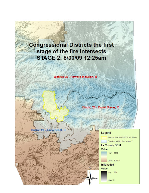
In my map, I have overlaid the referential layers of the Station Fire (county boundaries and a DEM), with the thematic portion, congressional district lines. I chose to show the congressional districts that were affected by the fire (four in total), because often times disasters (man-made or natural), play very big parts in determining the success or failure of the politicians involved. Their approval ratings will go up if the public sees that they do a good job of responding to the disaster, and will go down if they are slow to take action, or aren’t properly sympathetic, etc. For example, there was a lot of public outcry and resentment towards Bush for his response to Katrina (Roberts 2005), and same with Obama for the Gulf oil spills. What party a politician belongs too also plays a large part in what his response will be, and how the public views them (for example, if a politician has been campaigning on a pro-nuclear energy platform, and then there is a power-plant failure, then it’s pretty much over for them).

As you can see in the maps, I chose five stages of the Station fire (five different times and days), and created a separate layer for each of them to show which district they were affecting. The fire started out burning in only two congressmen’s districts, but then spread to a third, and finally a fourth. Two democrats, and two republicans (Cabanela). However, despite it being interesting to see the spread, I don’t actually think that the fire affected those politicians careers too badly. For one thing, the fire problem was clearly a statewide issue, and not limited to LA county, and those four politicians. It wasn’t anyone’s fault aside from the guy who started the fire. For another thing, most of the blame for slow response fell on the U.S. Forest Service. In fact, there was a congressional investigation (Pringle, 2010).
Yet, it is definitely important to remember that all of real-life politics involves geography, because politicians and political boundaries, etc, are all connected to physical places. And when physical disasters like fires occur, there are bound to be political, not just environmental and physical, repercussions. 


This first map is just the reference map of LA county, the district borders, and the fire spread. In order from earliest to latest fire spread, it goes: red, yellow, blue, purple, pink. As you can see the fire expanded very rapidly.


this next picture is a close up of an extracted layer: just the first fire spread and the districts it affects.


This is stage 2 and the district it affects:


Stage 3:


Stage 4:


And stage 5:

Sources:

"2010 Russian Wildfires." Wikipedia, the Free Encyclopedia. Web. 27 Nov. 2010. <http://en.wikipedia.org/wiki/2010_Russian_wildfires>.

"California in the 111th Congress (2nd Session)." Contacting the Congress. Juan Cabanela. Web. 27 Nov. 2010. <http://www.contactingthecongress.org/cgi-bin/newseek.cgi?site=ctc&state=ca>.

“InciWeb the Incident Information System: Station Fire News Release." InciWeb the Incident Information System: Current Incidents. 26 Sept. 2009. Web. 27 Nov. 2010. <http://inciweb.org/incident/article/9640/>.

McIntire, Nathan. "Names of Firefighters Killed in LA Station Fire Added to Memorial Wall." Fire News, Products, Training, Jobs for Firefighters - FireRescue1. The Pasadena Star - News, 6 May 2010. Web. 27 Nov. 2010. http://www.firerescue1.com/fire-products/firefighter-memorials/articles/816235-Names-of-firefighters-killed-in-LA-Station-Fire-added-to-memorial-wall/

Pringle, Paul. "Federal Inspector General Launches Probe of Station Fire - Los Angeles Times." Featured Articles From The Los Angeles Times. LA Times, 04 Aug. 2010. Web. 27 Nov. 2010. <http://articles.latimes.com/2010/aug/04/local/la-me-station-fire-20100804>.

Roberts, Joel. "Poll: Katrina Response Inadequate - CBS News." Breaking News Headlines: Business, Entertainment & World News - CBS News. CBS News, 8 Sept. 2005. Web. 27 Nov. 2010. <http://www.cbsnews.com/stories/2005/09/08/opinion/polls/main824591.shtml>.

Wednesday, November 17, 2010

Geo7 Lab 6 - Data Elevation Models!!!!

Lab 6:
For this lab, I chose to do a model of where I'm from - the SF Bay Area (specifically Berkeley). The section of map I downloaded shows all the most important parts of the Bay Area: San Francisco, Marin, Oakland, Richmond, Berkeley, Palo Alto, Orinda, etc. (You can see Berkeley, because it's right where that long pier is sticking out of on the East side of the Bay). The scale of my map is 1: 441,754, which is a really weird number. I wasn't really paying attention to the scale except to make sure that it was within the parameters of the assignment, otherwise I would have made it into a nicer, round number. The exact parameters of my grid in decimal degrees, starting with the Northwest corner and rotating clockwise is:
(38.096°N, -122.727°W)
(38.096°N, -121.992°W)
(37.591°N, -121.992°W)
(37.591°N, -122.727°W)


Spacial reference: GCS North American 1983
Datum: North American 1983

And without further ado, the maps:


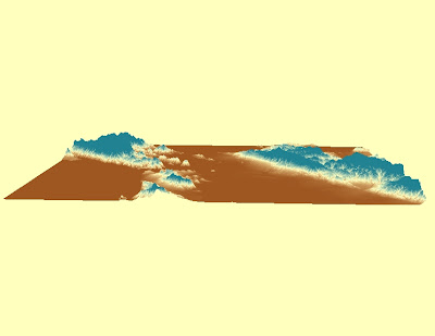
 Now the 3D rendering of the model, in a few different views:
 an "at eye level" view:
 and one more...

Friday, November 5, 2010

Week 6 Lab 5


This week in lab we looked at the differences in distance between Washington DC and Kabul, Afghanistan, depending on what map projection we used. We had to do six projections – two for each type (conform, equidistant, and equal area). It was pretty surprising how drastic the differences in distance were between projections. When I think about distance, I think that it is a unique number – if we can measure it, then it’s always the same, right? WRONG. At least in terms of global map projections, distance gets distorted in a certain way.

From this exercise the significance of map projections are pretty obvious. They are absolutely necessary based on the very nature of what a map is. The world is a sphere-like orb, and paper is two-dimensional. Therefore it is the eternal problem of the map-maker to figure out how to display a 3D thing onto paper. Obviously, people have disagreed about the best ways to do so, and thus, the many projections we have.

Conformal map projections preserve angles locally. Aside from geography, conformal maps are used greatly in physics and engineering, as their angle-preserving nature lends itself to many math problems and equations (for example, the Mercator map was created as a navigational tool, whereby the commonly traveled routes appeared as straight lines). Equidistant maps preserve distance from some standard point or line, ie the equator or the prime meridian, or both. If both, it is called an equirectangular projection, which is what the Plate Carrée model is. Finally, an equal-area projection is one in which every grid section has the same area.

All of these maps have different implications and uses. For example, while the Mercator map was probably useful to the sailors that invented it hundreds of years ago, today its distortions are very misleading to our general worldview. Because of the way each map type displays the world, they might be used by different special interests. Again with the Mercator, the Northern Hemisphere has kept it in widespread use in schools for so long, because it makes North America and Europe look way bigger in proportion to South America and Africa than they should. Thus the “importance” of each hemisphere is skewed.

We have to be really careful when deciding which projection to use, because though most of them distort one or more aspects of the world, it is a very subtle distortion. None of them, even the Mercator, are wrong, they are just displaying information in different ways. Most Americans, myself included until a few years ago, don’t know how skewed their perception of the world is, and so I think that it is extremely important for schools and other institutions to use as accurate a projection as possible (cartographers say these are square-grid, and not rectangular-grid projections).
 

Thursday, November 4, 2010

ArcGIS Tutorial Blog


Write Up:

This Lab was all about getting to play around and familiarize ourselves with ArcGIS, a brand of GIS software. Essentially we were walked through a five part tutorial in which we created a mapping system representing all the data involved in a plan to expand an airport. The software allowed us to combine different "levels" of information (eg land use, population density, etc) together to see how they all interacted with one another. We added roads, created graphs, assigned colors to data types, and in doing so, were able to get a pretty clear picture of what the effects of the expansion project would be.

Actually using the software really made me realize how useful GIS is, and why it is in such hot demand right now. It can be useful in almost any area: land conservation, urban planning, remote sensing, utility management (and basically every other kind of management, including human resources!), agriculture, and basically everything else. GIS does it all - it inputs data, stores that data, edits, analyzes and displays that data, and in the end, makes for a really great tool for informed decision making. 

Unlike with conventional maps, which are two dimensional and difficult to integrate with one another, GIS is very three-dimensional, in that you can add and subtract geographic and statistical data at will. In the map we did for lab, we were steadily increasing the amount of information our map was displaying, in order to show us just how much one can do with the software. However, just as easily we could have been using it to display only a few, isolated areas of interest, and seeing how they interact with one another.

Yet, the part of GIS that makes it the most useful, I think, is its ability to incorporate time into the picture. GIS not only can accurately model the complexities of the real world with it's various layers, it can show how they will continue to interact and change over time. Thus it's a really great tool for predicting what will happen, given that x, y, and z interact like this, allowing companies/environmentalists/individuals/whomever to optimize their behavior.

This is not to say that GIS is without certain drawbacks. As was made clear to me doing this lab, GIS is REALLY COMPLICATED. To be proficient in it, one really needs to have a decent understand of computers, and data manipulation. In our lab, all of the hard work was done for us: all of the data was handed to us on a silver platter, and we had our hand held every step of the way as we moved it around. And of course, this means that GIS is very dependent on the source material of one's date: ie all the various inputs. If your data is not accurate, then your map will not be accurate. Or it could be accurate, but still conflict with someone else's also-accurate map, if the two have conflicting agendas. 

In summary: GIS is a great, awesome tool BUT - be careful with it! it's not the easiest to use, and is often employed to serve someone's agenda, and thus should be taken with a grain of salt, like all things.